Social media reporting, and who it is really for
Forty numbers, three charts, no argument, and nobody replies. Here is the whole practice, and the five parts that survive.
Most social media reports are read for about ninety seconds by somebody who wanted one sentence. They contain forty numbers, three charts and no argument, and the person who spent a day building one will tell you nobody ever comments on it. Both facts have the same cause.
This is the complete guide to social media reporting: who a report is actually for, what belongs in one and what does not, how often to send it, why automation makes bad reports faster, and how to report a bad month without losing the account.
TL;DR
| Reader | What they want | Length |
|---|---|---|
| A client paying you | Reassurance, then evidence | One page |
| An executive internally | The decision, and the risk | Five lines |
| The team doing the work | What to change next week | As long as useful |
| A board | Trend, and whether to fund it | One slide |
| Nobody in particular | Nothing, and they get it | Do not send it |
The only question that matters: who reads it
A report is a document written for one named person to make one decision. When that person is unspecified, the writer defaults to including everything, because everything is safer than choosing, and the result is the forty number document nobody reads.
Naming the reader changes the document more than any tool ever will. A client wants to know their money is working and that somebody is paying attention. An executive wants to know whether to keep funding it. The team wants to know what to do differently on Monday. Those are three different documents and only one of them contains a chart.
If you cannot name the person who will read it and the decision they will make, the correct length of the report is zero pages.
What belongs in a report
Almost every good report, for any of those readers, has the same five parts in the same order. The parts are short, and none of them requires a tool to produce. The discipline is entirely in what gets left out, which is why reporting is a writing problem wearing a data problem's clothes. The wider practice the numbers come from is in social media analytics.
- One sentence at the top. What happened and what you are doing about it. If the reader stops here they should still have the answer.
- What was promised against what was delivered. The one section that builds trust, and the one most reports omit because it can be uncomfortable.
- Two or three numbers, each with its previous value. A number without a comparison is decoration.
- What travelled, and what it was about. The only section anybody reads twice, and the one that changes next month's work.
- What happens next. A report with no next step is a receipt, and receipts do not get replies.
The second part is worth defending. Reporting delivery against commitment is what separates a report from a highlight reel, and clients notice the difference within two cycles even when they never say so. The full template, section by section, is in how to build a social media report.
What does not belong, however available it is
The availability of a number is not an argument for including it. Most report bloat comes from a dashboard that offers a metric, so it goes in, and then it has to be explained every month forever.
- Impressions as a headline. The largest number available, moved mostly by things nobody in the room controls, and the one clients learn to distrust first.
- Every network, given equal space. If three quarters of the effect is on one network, the report should look like that.
- Screenshots of a dashboard. They prove a tool was opened. They do not make an argument.
- Follower counts week on week. On any account under a few thousand this is noise dressed as a trend.
- A metric nobody asked for that has never changed a decision. Remove it. If anybody misses it, put it back.
The last item is a good annual exercise. Take last year's twelve reports and mark every number that ever led to a different action. In most teams the answer is three or four numbers out of thirty, and the other twenty six were pure cost.
How often, and why weekly is usually wrong
Reporting cadence is set by how fast the underlying thing moves and by how fast the reader can act, whichever is slower. Social numbers move slowly on small accounts and executives act monthly at best, so most weekly reporting is a habit rather than a decision, usually inherited from whoever set the process up and never revisited since.
| Cadence | Who it suits | The risk |
|---|---|---|
| Weekly, internal, five lines | The team doing the work | None, if it stays short |
| Monthly, one page | Clients and executives | The default, and usually right |
| Quarterly, with benchmarks | Boards and renewals | Too late to change anything |
| Weekly, to a client | Almost nobody | Trains them to read noise |
The bottom row causes real damage. A client sent a weekly report learns to react to weekly variation, and weekly variation on a social account is mostly randomness. Two months later you are explaining a bad week that means nothing, every week.
Why automation makes bad reports faster
Automated reporting is sold as the answer to the day spent assembling numbers, and it genuinely solves that. What it does not solve, and quietly makes worse, is the part that determines whether the report works.
A generated report has no sentence at the top, because a tool cannot know what happened. It has every available metric, because including them is free. And it arrives on a schedule whether or not anybody looked at it, which is how a client ends up receiving twelve documents nobody on either side has read.
- Automate collection, never interpretation. Numbers assembled by a machine, argument written by a person, is the only division that works.
- A template is not a report. The template is the cheap part. The sentence at the top is the whole product.
- Beware the branded PDF. It looks like value and it is the easiest thing in the process to produce.
- If nobody replies for three months, stop sending it. Then see who asks. Often nobody does, and that is the finding.
The tool shortlist for the collection half, sorted by what each product can actually read, is in best social media reporting tools for clients.
Reporting across networks without averaging unlike things
The moment a report covers more than one network, a quiet arithmetic problem appears. The same word means different things in each place, and a combined total is an average of unlike things presented as a fact.
A view on one network and a view on another are counted under different rules. An engagement includes clicks on one surface and not on another. Adding them produces a number that is larger, tidier and wrong, and once it is in a report it is very hard to remove.
- Only add posts published. It is the one quantity that means the same thing everywhere, which is part of why it deserves the top line.
- Split every other number by network. More rows, less impressive, and true.
- Never compute a blended engagement rate. Two different denominators averaged together is not a rate, and the definitions are in how to calculate engagement rate.
- Say which network the story is about. Almost always one of them carries the effect, and the report should say so out loud.
This is the single most common way an otherwise careful report becomes untrustworthy, and it usually enters through a dashboard that offers a total because a total is easy to compute.
What a reader actually remembers
A month after a report is sent, what survives in the reader's head is not a figure. It is a direction and a feeling about whether the people doing the work know what they are doing. Everything in the document is either building that or spending it.
This has a practical consequence that reads as cynical and is not. Consistency of format matters more than completeness of content, because a reader who recognises the shape of the document can read it in ninety seconds and will. A report redesigned every quarter is read from scratch every quarter, which usually means it is not read.
- Same sections, same order, every time. Even when a section is short this month.
- Same definitions, all year. A denominator that changes in July makes the first half of the year unreadable.
- Same length. A report that doubles in a good month and halves in a bad one has told the reader everything before they open it.
- Same sender. Reports that arrive from a rotating cast get treated as administration.
None of that requires a better tool. It requires deciding the format once and then defending it against the temptation to improve it, which is harder than it sounds and is most of the job.
What a report costs, and who pays it
A monthly client report assembled by hand takes most people between three and six hours once you count collecting numbers, writing, formatting and the internal review. Across ten clients that is a week of somebody's month, every month, spent on a document read for ninety seconds.
That figure is worth calculating honestly before buying anything, because it is the only number that tells you whether tooling is justified. Most teams have never done the arithmetic, which is why the conversation about reporting software is usually about features instead of about hours.
| Where the time goes | Share of the work | Can it be automated |
|---|---|---|
| Collecting numbers | Half of it | Yes, completely |
| Formatting | A quarter | Yes, with a template |
| Working out what happened | A fifth | No |
| Writing the sentence | The rest | No, and it is the product |
Three quarters of the work is mechanical and the remaining quarter is the entire value. That split is the whole case for automating collection and none of the case for automating the document, and it is also why a team that automates everything ends up sending something worse than what it replaced.
How to report a bad month
Every programme has them, and how they are reported determines whether the relationship survives the second one. The instinct is to find a metric that went up and lead with it. That instinct costs more than the bad month does.
Readers are far better at spotting a hedge than writers expect. A report that leads with a rise in impressions during a month when nothing shipped teaches the reader that the report is advocacy, and from then on they discount everything in it, including the good months. That discount is permanent and it is expensive, because the credibility spent covering one weak month has to be rebuilt over several strong ones.
- Name it in the first sentence. Before the reader finds it themselves, which they will.
- Give the cause if you know it, and say so if you do not. Do not know is a credible answer. A wrong confident one is not.
- Bring the change with you. The report is where you say what is different next month.
- Keep the commitment section honest. Two of four posts published is a fact, and reporting it is what makes the good months believable.
Reporting for clients, which is a different job
Client reporting carries a load internal reporting does not: it is also the evidence that the retainer is being earned. That changes what belongs in it, and it is why agency reports drift toward volume. Volume looks like work, and a thin document can read as a thin month even when the month was good.
It also runs into a structural problem when the work is personal branding rather than a brand page. The accounts being grown belong to the client's own people, nobody will connect them to an agency tool, and so the agency cannot report on the thing it was hired to do. That specific bind is covered in client reporting for personal branding.
The way out is to report from the public side of those profiles, which is available on day one, needs nobody's permission, and covers exactly the columns a client cares about: did the people post, is the audience growing, and what did people react to. It is a smaller data set than a connected account gives, and it happens to contain every column that belongs in the report anyway.
How Groowth fits into this
Groowth does the collection half for accounts nothing else reaches. You paste public handles, and it records what each account published and when, the follower count, and the public reactions on each post, once a day. Nobody connects anything, which is what makes it work on a client's own team.
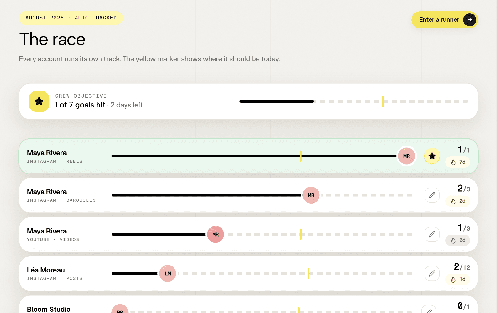
It does not write the sentence at the top and it never will, because that sentence is the part a person has to own. It never shows reach or impressions on an account it is not connected to, which happens to remove the metric most likely to bloat a report anyway. The wider picture of what is measurable from outside is in public social media metrics. Three accounts are free with no card.
Frequently asked questions
What should a social media report include?
One sentence saying what happened, what was promised against what was delivered, two or three numbers each with their previous value, what travelled and why, and what happens next. Everything else is optional and most of it is cost.
How often should you send social media reports?
Monthly for clients and executives, weekly and very short for the team doing the work. Weekly reporting to a client trains them to react to variation that is mostly randomness, and you will spend months explaining meaningless dips.
Should social media reporting be automated?
Automate the collection of numbers, never the interpretation. A generated report has no argument at the top, includes every available metric because it is free to, and arrives whether or not anyone reads it.